
Case Study – The colours in Tunbridge
Project Overview
We were approached by a client who wanted to break free from the neutral tones often seen in modern kitchens. Their vision: a vibrant, welcoming space that reflected their personality, bold, warm, and full of life.
The brief was clear: create a space that felt homely and functional for family living, with standout colour elements and clever storage, while still feeling calm and refined.
Design Consultation & Concept Development
In our initial consultations, the client expressed a desire for a kitchen that would feel joyful yet practical. Their love for colour was front and centre, but they also wanted to balance that energy with natural tones and timeless finishes.
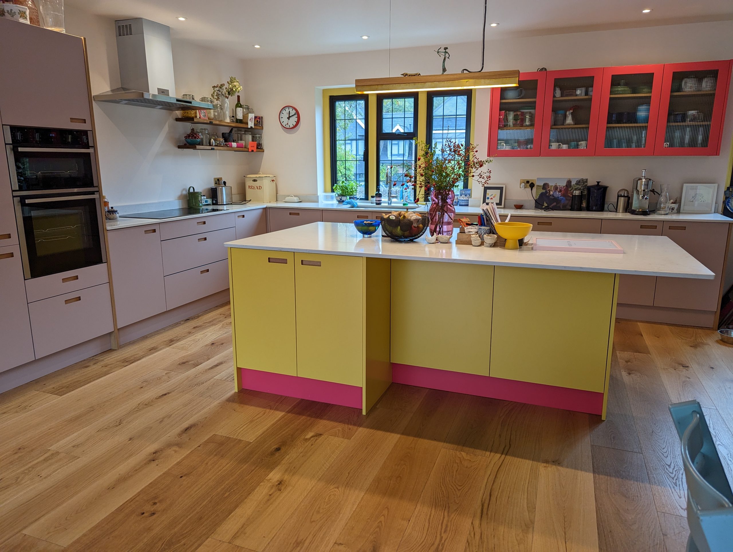
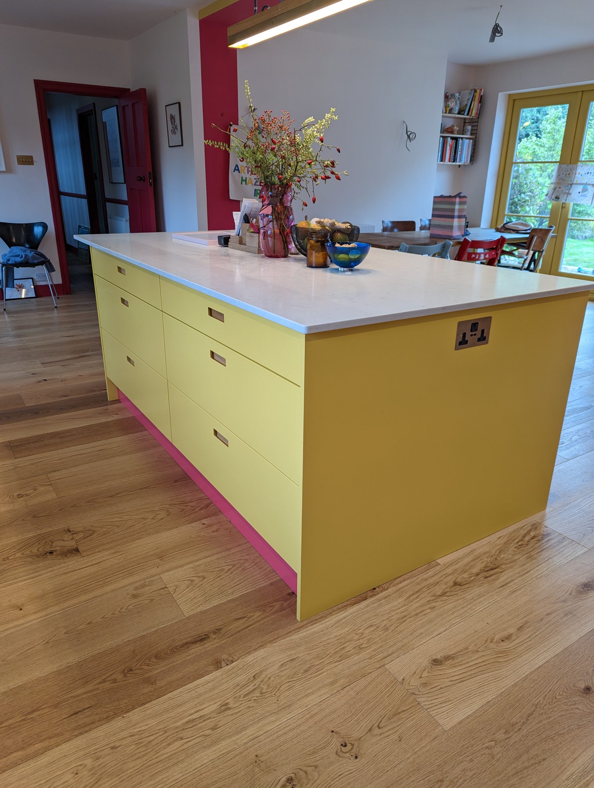
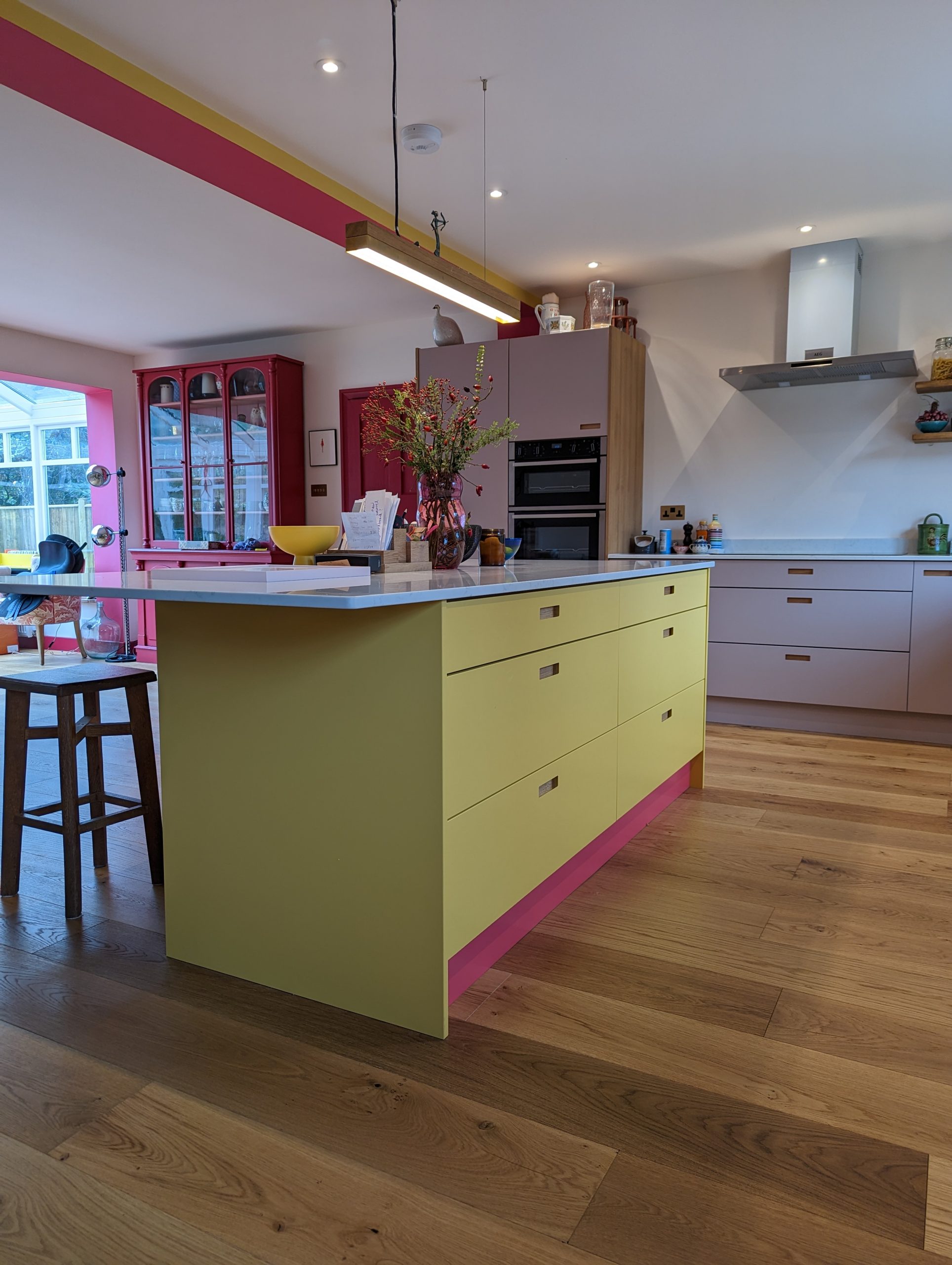
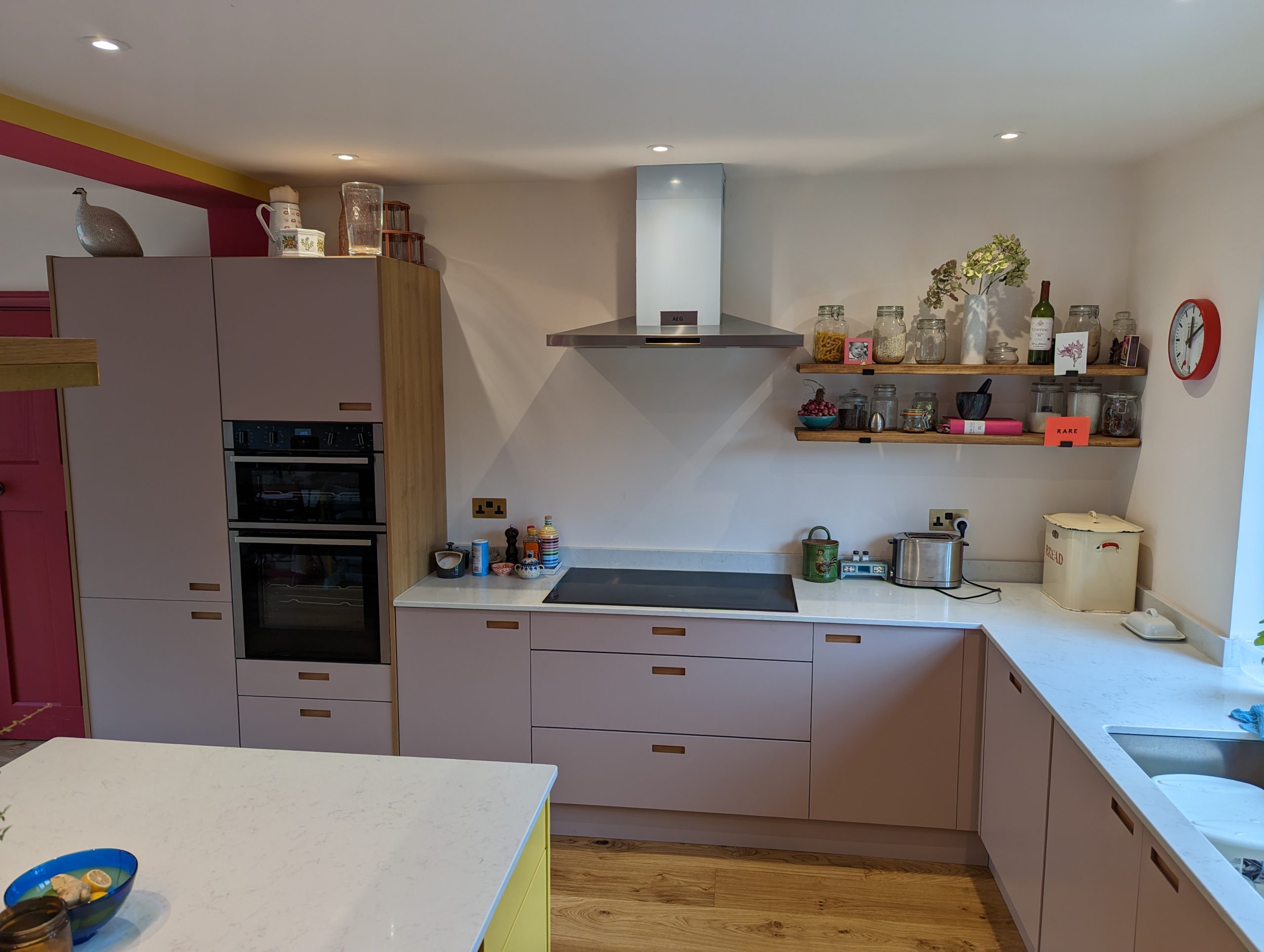
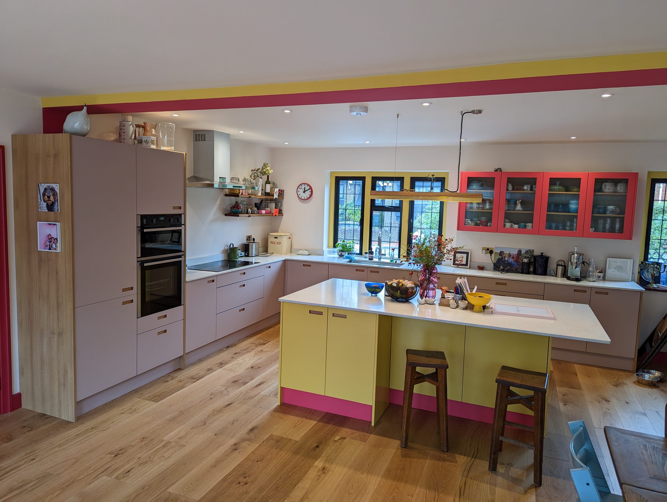
- Colour Statement: The centrepiece would be a bespoke island finished in F&B 223 Babouche with a bold pink plinth in the form of Little Green Leather. A daring yet delightful choice.
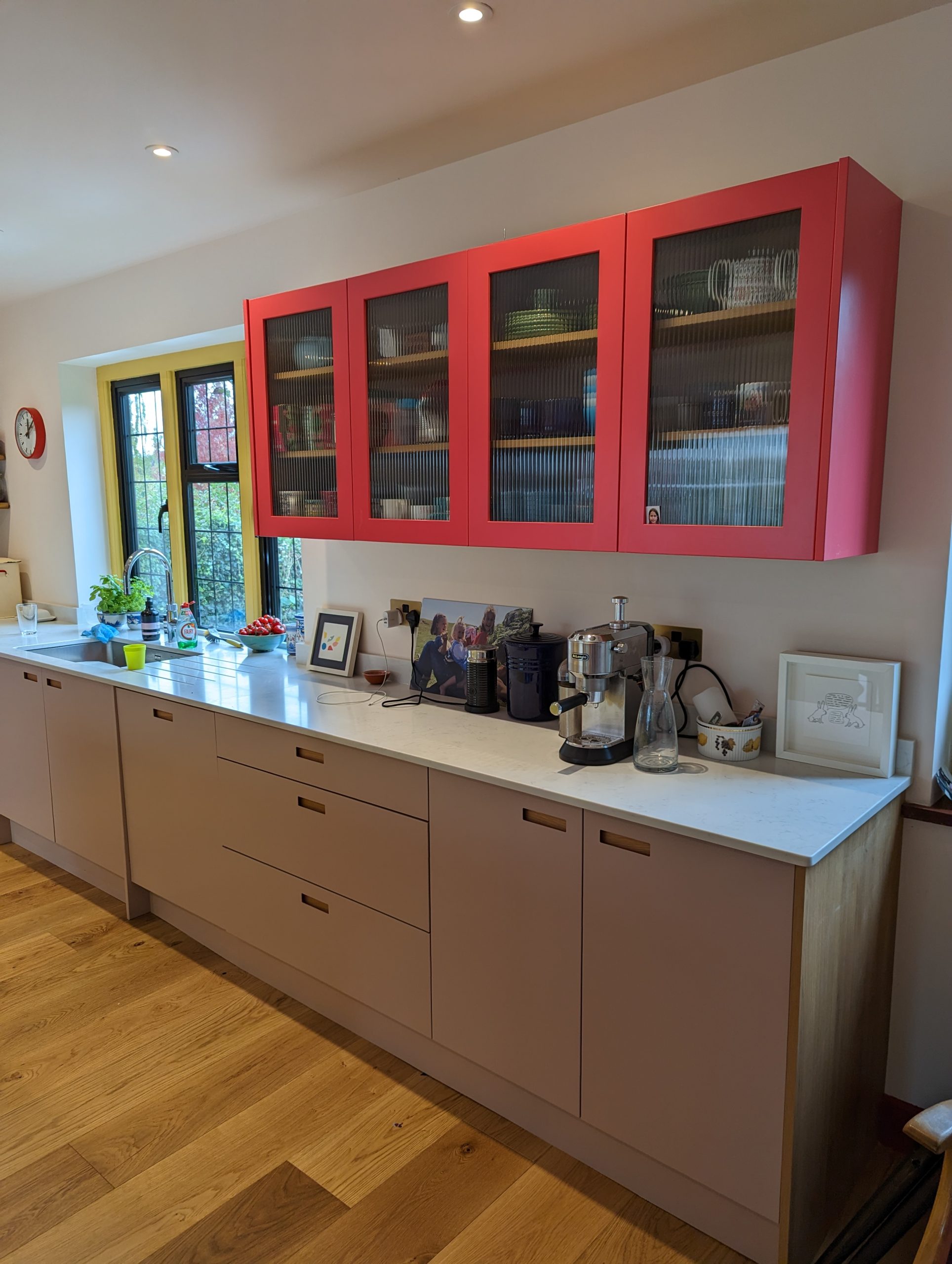
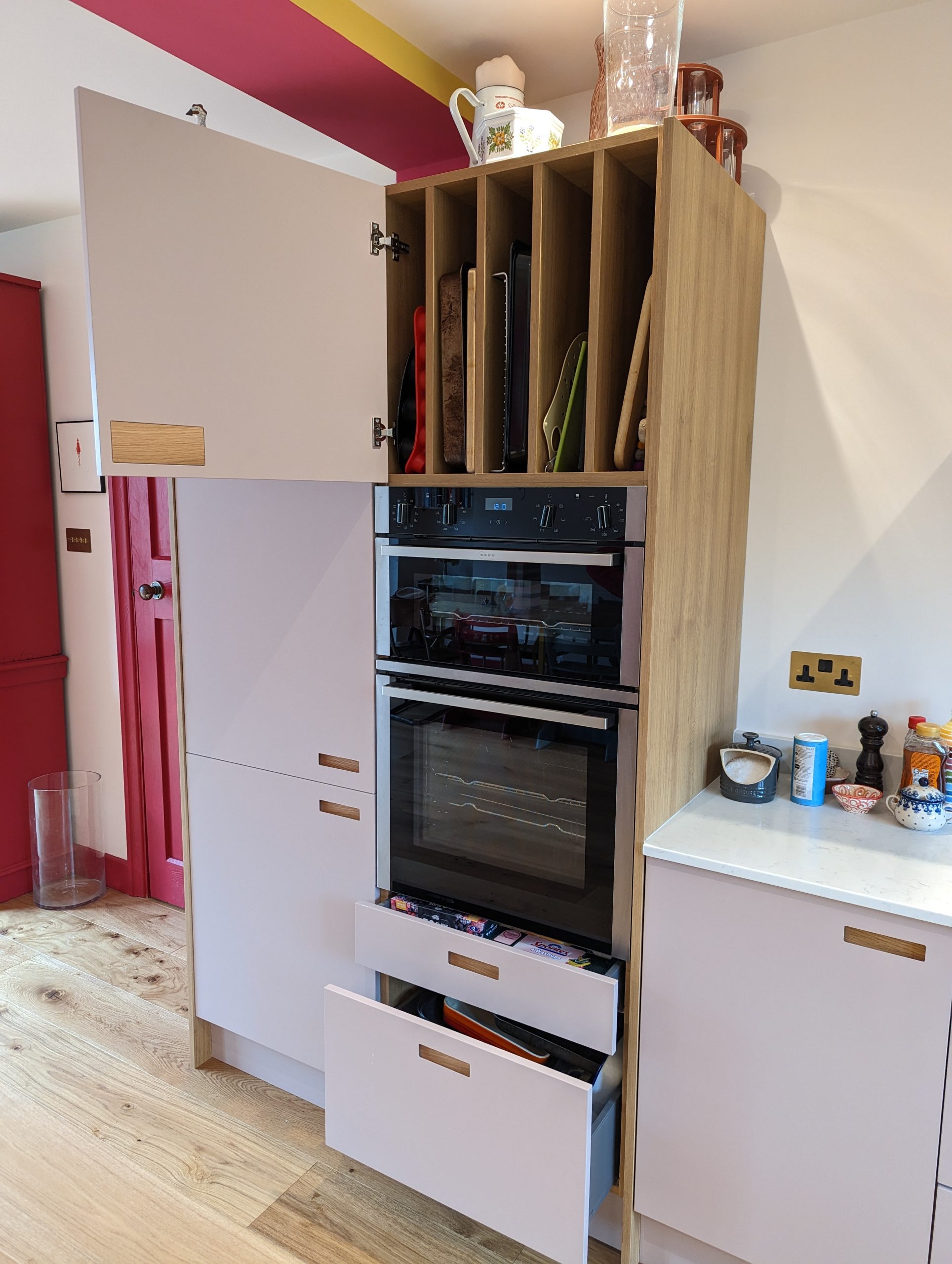
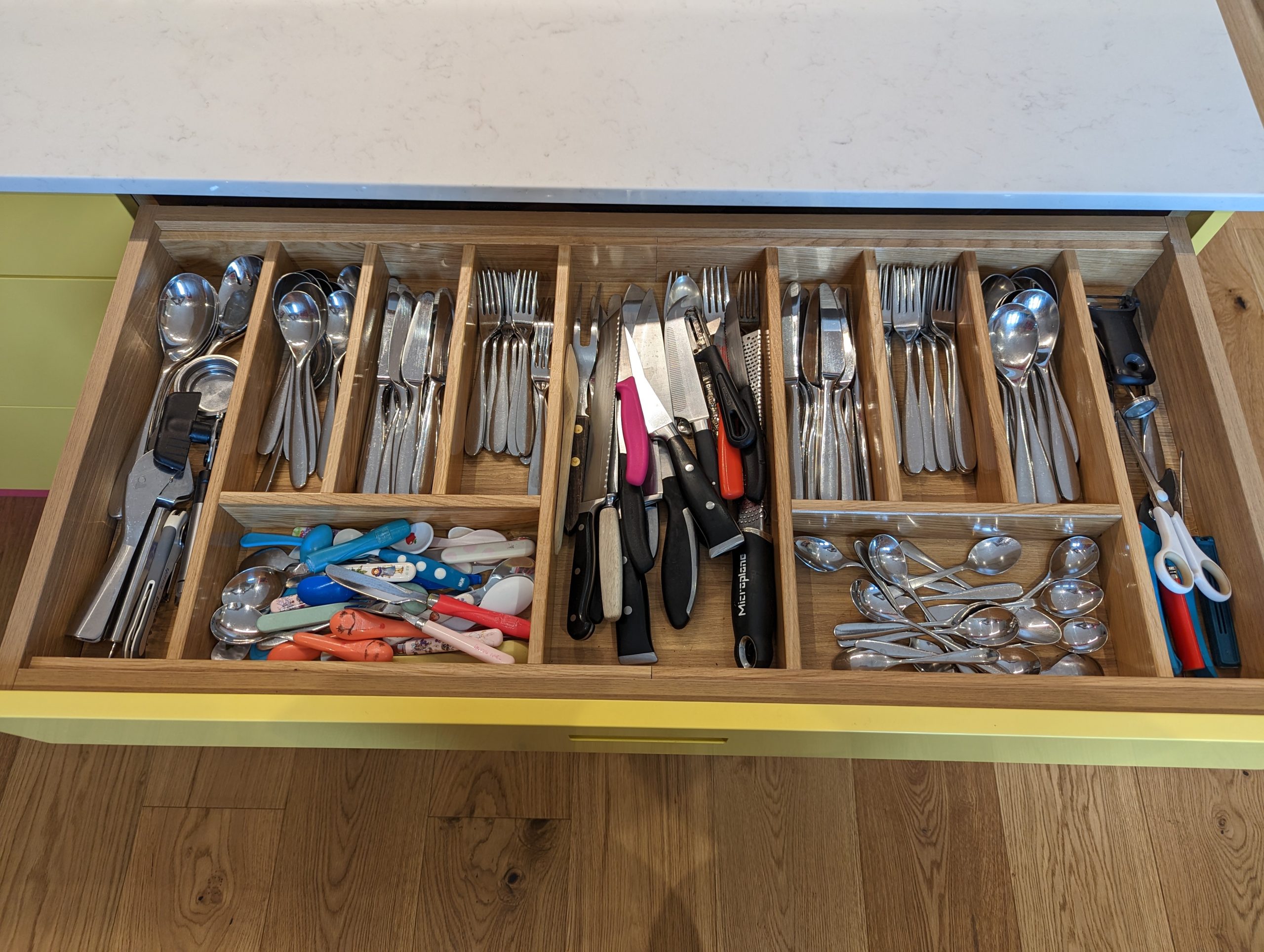
- Cabinetry: Streamlined handle-less design carved out and finished with a oak backplate elegantly finished the fascia of the cabinetry. A mix of tall storage, deep drawers, and lots of available worktops made the space both beautiful and highly efficient for family life. This paired with a mix of open shelving and fluted glass-fronted cabinets for personality and accessibility.
- Keeping the Classics: Oak end panels were introduced as a natural framing detail, adding warmth and grounding the bright colours. These panels beautifully complement both the painted finishes and the engineered oak flooring, tying the entire palette together with subtle elegance.
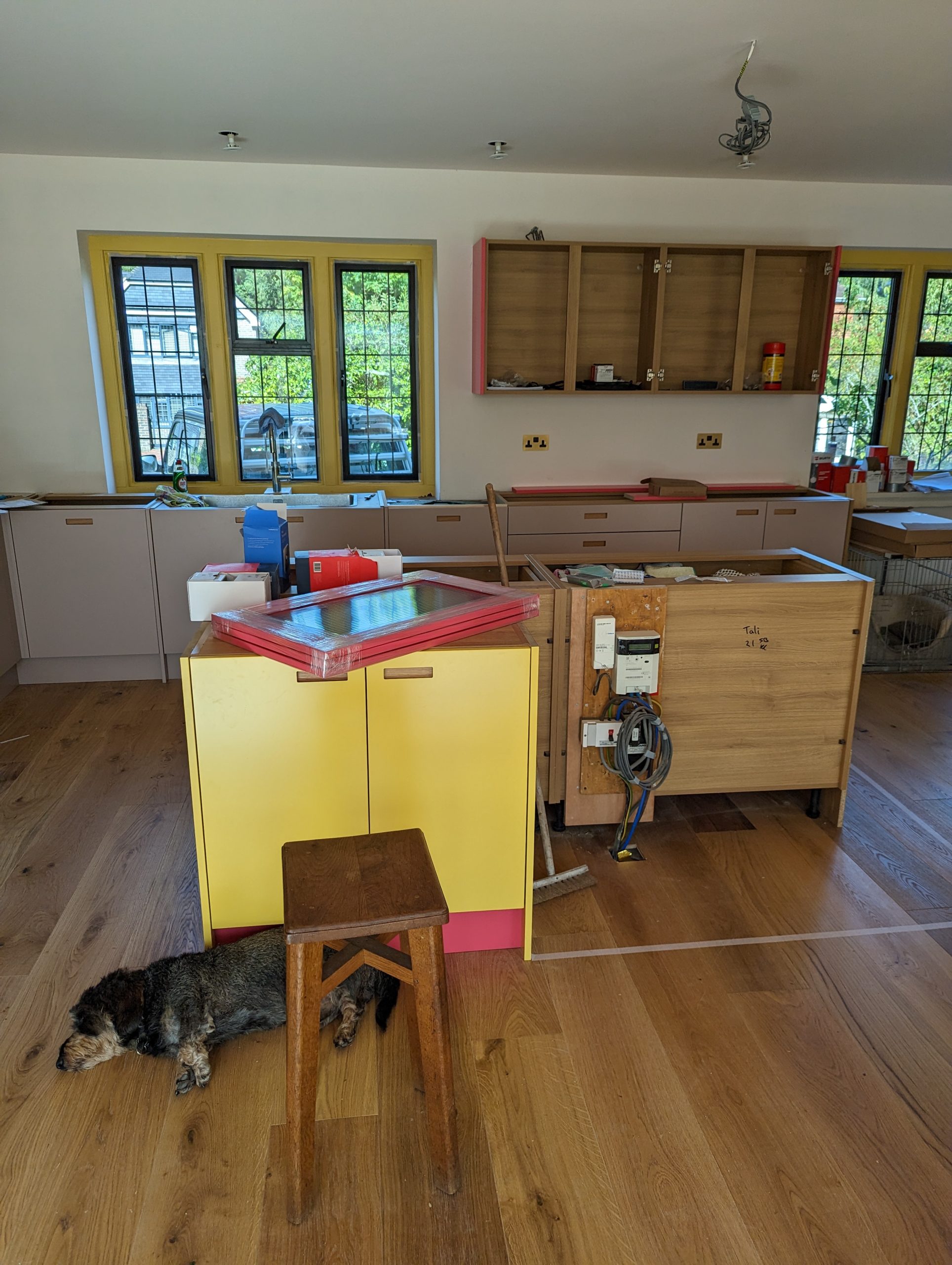
The Build & Installation Process
Once the design was approved, we moved on to sourcing materials and starting the build. The installation process followed these key stages:
1. Preparing the Space
- All electrical and plumbing points were configured to suit the appliance and lighting layout.
- Wide-plank oak flooring was installed to provide warmth and continuity throughout the open-plan space.
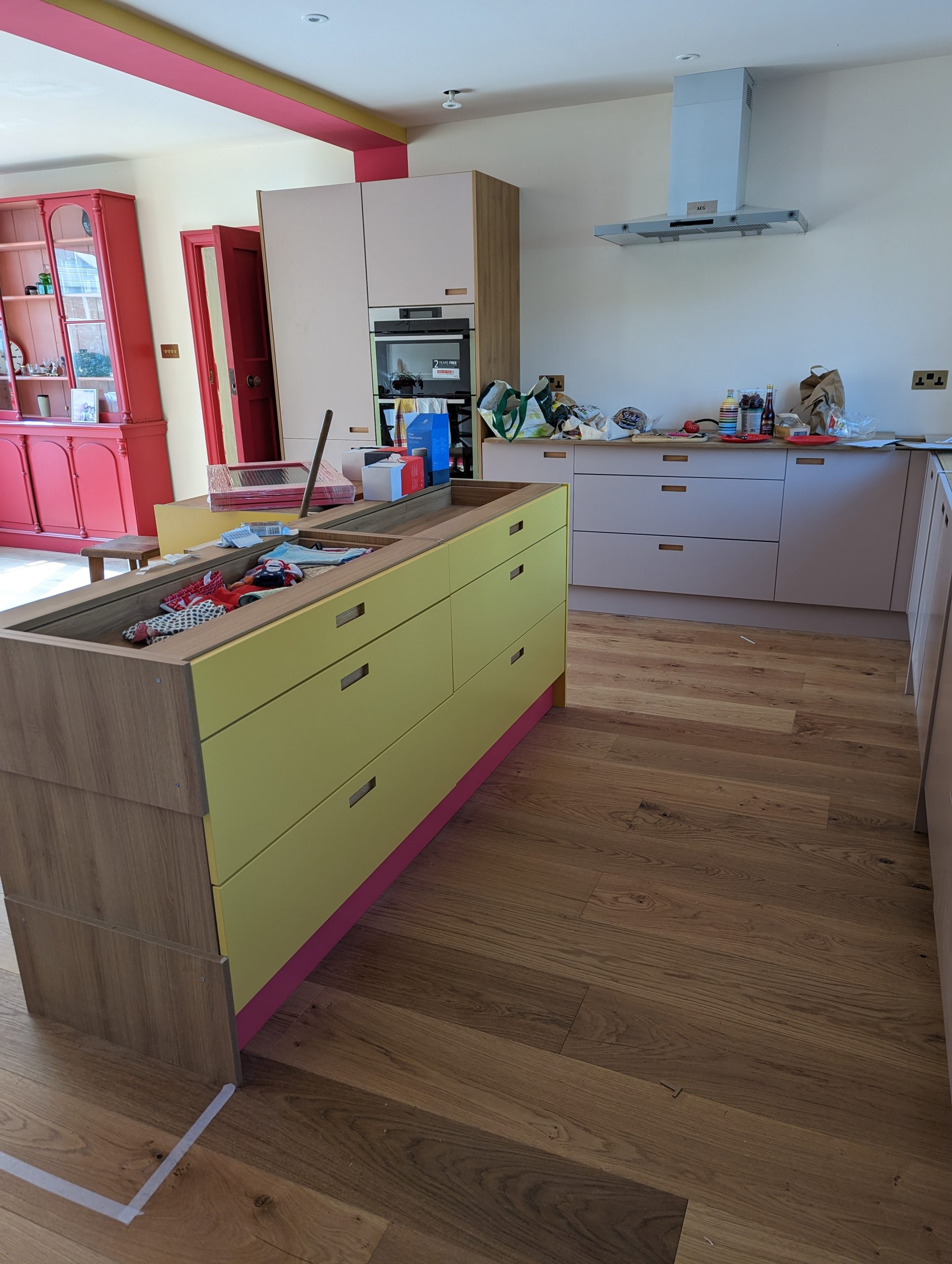
2. Cabinetry & Storage Installation
- Blush pink cabinetry with discreet finger-pull grooves offered a contemporary and understated backdrop.
- The yellow island, with its custom pink plinth, brought playful energy and generous storage capacity to the centre of the room.
- Natural oak end panels added warmth and a sense of craftsmanship, subtly linking the cabinetry with the flooring.
3. Worktops and Features
- Bright white quartz worktops offered a crisp, clean contrast to the cabinetry and provided a durable, practical surface.
- Open oak shelving above the hob provided both decorative and functional space, ideal for everyday essentials and personal touches.
4. Appliance Integration
- Integrated double ovens, induction hob, and a stainless steel extractor ensured the aesthetic stayed uncluttered and contemporary.
The Final Result
This kitchen now feels alive. Full of colour, character, and thoughtful design. The vibrant island invites interaction, while the surrounding cabinetry keeps everything streamlined and grounded. The oak accents subtly bridge the gap between bold and neutral, giving the whole space warmth and cohesion.
It’s a space that doesn’t play it safe, and that’s exactly what the client wanted. At the same time, it’s highly functional, with plenty of storage, smart appliances, and room for cooking, gathering, and living.
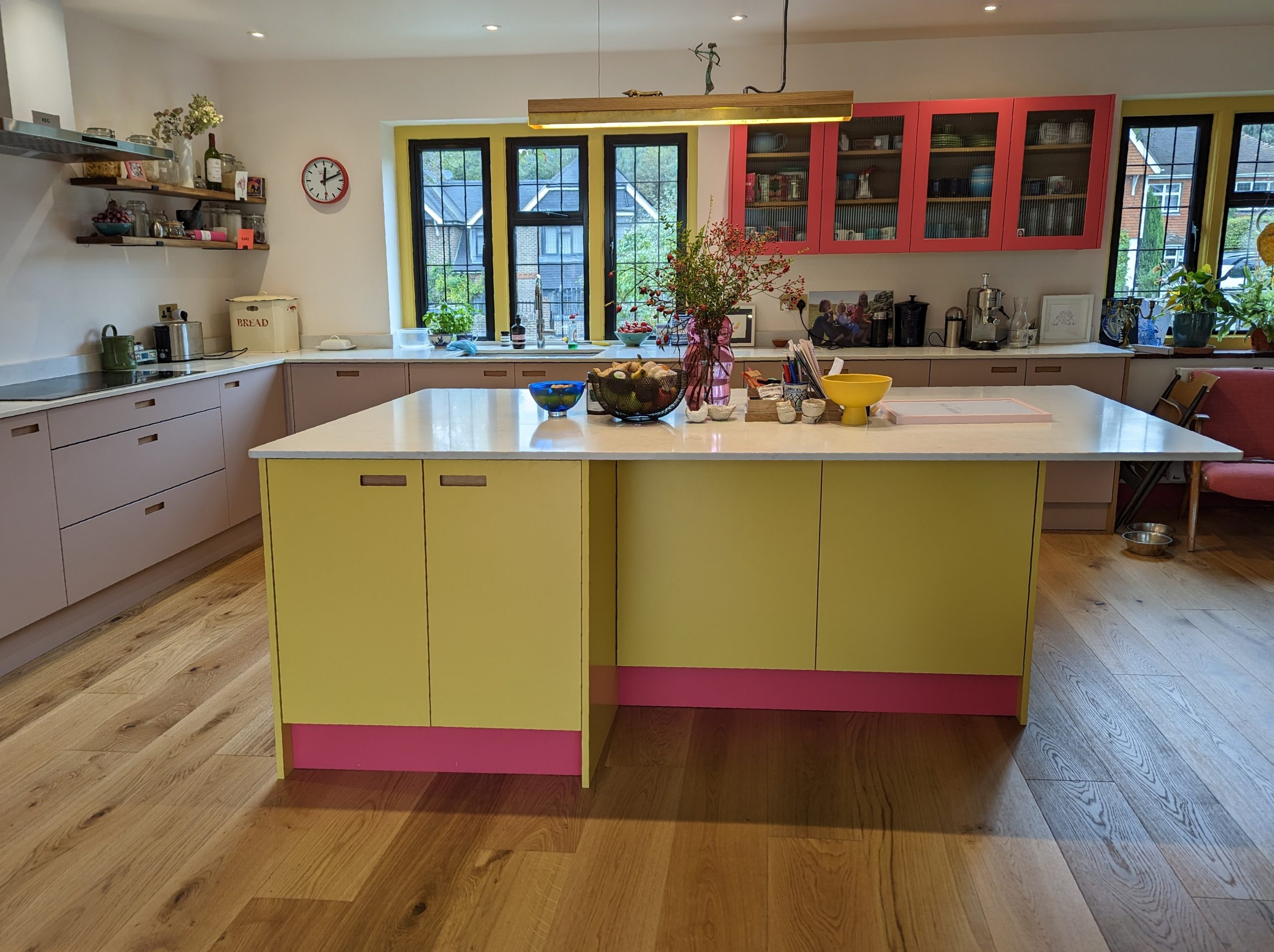
The space is now a hub for cooking, entertaining, and everyday living, perfectly tailored to the client’s high standards.
Client Feedback
“We wanted something different and Culmen absolutely delivered. The yellow and pink island makes us smile every day, and the whole space just works so well for our family. It’s practical, beautiful, and totally us.”